I’ve been busy reading more on transportation and climate change over the last few months. Before I post any more “big” articles, I wanted to take a moment to praise one pair of figures from David MacKay’s great book, Sustainable Energy Without the Hot Air. It’s available free online, but I thoroughly recommend buying the elegantly typeset, figure-filled hard copy.
MacKay’s great strength lies in communicating numbers: using these simple, visual representations, a single consistent set of units throughout the book, and back-of-the-envelope calculations that are designed to illustrate the cases at hand, he’s assembled a solid book. MacKay doesn’t cover the politics or economics, and he doesn’t frame the book in terms of climate change, although that’s clearly the key underlying motivation.
Here’s the background: an example of a simple visual story, showing why burning fossil fuel reserves represents a massive change to the climate system. I’m going to paraphrase MacKay to cut to the chase, but if you prefer, please read MacKay’s original text, pages 241-243.
Throughout the book, MacKay uses a type of figure where the area of a box represents its size. The bigger the box, the bigger the number, and it’s really easy to visually compare different boxes.

“Until recently, all these pools of carbon [shown in the above figure] were roughly in balance: all flows of carbon out of a pool (say, soils, vegetation, or atmosphere) were balanced by equal flows into that pool. The flows into and out of the fossil fuel pool were both negligible. Then humans started burning fossil fuels. This added two extra unbalanced flows, as shown [in Figure 2].”

The flows shown in Figure 2 (right) are from fossil fuels to the atmosphere, and from the atmosphere to the surface waters. As shown, roughly one quarter of the fossil carbon winds up in the oceans on a short timescale of 5-10 years; recent research indicates that this may be reducing as the surface waters saturate, however. Some carbon is moving into vegetation and soil, perhaps 1.5 GtC/y, but this is less well measured. What is observed today is that roughly half of the fossil carbon stays in the atmosphere.
Now, throw one more number into the mix: if fossil fuels remain our dominant energy source, then carbon pollution under “business as usual” is expected to emit 500Gt of carbon over the next 50 years, with roughly 100Gt expected to be stored in the surface waters of the ocean (at 2Gt/year). By looking at the figure, it is clear that the amount of carbon in the fossil fuel supply dwarfs the carbon in the atmosphere.
The figure shows quite clearly that if we’re talking about burning a large fraction of the remaining fossil fuels, we’re talking about major disruptions in the carbon balance. Something has to take up the carbon—either the atmosphere, surface waters, soils or vegetation, and all data to date suggests that the atmosphere is where the majority of the carbon winds up. Given the size of the fossil fuel slice, it’s easy to see how a doubling or tripling of atmospheric CO2 could happen within 50-100 years.
And yes, there’s a lot of carbon stored in the deep ocean—but as MacKay makes plainly clear in his discussion, the timescale for ocean mixing is thousands of years. “On a time-scale of 50 years, the boundary [between the surface waters and the rest of the ocean] is virtually a solid wall.”
Plus, the figure shows two risk areas: vegetation and soils from vicious cycles. If the high temperatures (caused by high atmospheric carbon) kill off vegetation or melt the tundra and release methane, large stores of carbon from the vegetation and soils categories could wind up in the atomsphere easily—and from the size of those boxes, it’s clear that could be a catastrophe. (As it happens, the IPCC A1FI scenario expects emissions of 1800-2500 GtC by 2100—I’d guess that means that much of the easily accessible fuels are burned, plus a substantial net release of carbon from vegetation and soils.)
At any rate, I like these figures because they clearly show this concept. By using a simple visual representation of quantity, and separating the steady state out from human-driven changes, MacKay cuts to the heart of the matter. Now, for comparison, here’s an IPCC figure (from their technical reports) showing carbon stores and fluxes (source is AR4 figure 7.3):

Confused yet? Black is preindustrial, red is human-caused. The IPCC figure can certainly be understood if you spend the effort, but it doesn’t leap off the page. Admittedly, it’s from a technical chapter that’s trying to communicate carbon fluxes rather than carbon stores; the comparison isn’t entirely fair. The IPCC has produced simpler figures (for other topics) in their policy-oriented chapters, but they could still borrow a few pages from MacKay’s book.
Emissions and the Tar Sands

I’ve been a little baffled by the tar sands’ villainization in the climate literature for some time. While a few photographs can clearly show that the tar sands have dire impacts on the local environment (as a recent National Geographic special showed), I haven’t really understood why the tar sands have been singled out for so much venom in the climate literature. About two years ago, I first saw the stats: if you measure all emissions from extraction to the tailpipe (a “well-to-wheel” basis), the tar sands are between 15–40% worse than conventional oil. Why, then, is tar sands oil so much worse than—say—a vehicle with 15–40% poorer fuel efficiency? Here in Canada, the tar sands represent a lot of potential wealth and jobs; why should our oil get singled out relative to Saudi crude?
My reading recently took me past a figure that illuminated the problem for me in many ways. The figure below is adapted slightly from Farrell and Brandt, “Risks of the Oil Transition,” Environmental Research Letters 1(1), 2006, although I’m sure it can be found in many places in the literature.

The horizontal axis here represents the number of barrels of oil possible with each source, the vertical axis represents the greenhouse gas emissions per barrel, and the area of each bar is therefore the total emissions if all possible fuel of that type is extracted and used.
The black bar to the left of the axis represents the emissions from all oil burned to date. Everything to the right of the axis represents the potential emissions from conventional and unconventional oil, in order of price per barrel. The oil used to date is dwarfed but what remains in the ground and could be emitted in the future.
Coming back to the tar sands, a few points can be drawn from the figure:
Transportation Research Board template for LaTeX
Last summer, I submitted my first paper to the Transportation Research Board (TRB) conference (ultimately accepted, and presented in January 2009). They have recently started accepting papers in PDF form instead of requiring a Word file—and this meant that I could write my paper in LaTeX, my preferred document processing system.
However, TRB doesn’t provide any LaTeX templates, so I took a shot at rolling my own based on the TRB Style Manual. It’s very primitive in its present state, but it’ll handle the page layout, headings, captions, fonts, and bibliography style.
Unfortunately, they still require a Word document if you plan to publish in their journal, Transportation Research Record. I’m submitting my paper to a different journal for publication, and that journal accepts LaTeX submissions. But if the ultimate destination for your paper doesn’t accept LaTeX or PDFs, take care.
- trb_example.tex: the template and an example document
- trb.bst: the bibliography style
- trb_latex.zip: all files, including a demo bibliography
For the record, a little discussion of my adventures in creating all of this. Most of it is fairly straightforward stuff—find the right packages to adjust margins, heading styles, fonts and so on. (Largely, this makes the document more ugly. The TRB journal format is quite unattractive, Word-like and dense, if you ask me.)
The one tricky part was the bibliography style. The recommended TRB citation style is different from any of the built-in LaTeX and BibTeX styles, and I wanted to replicate it correctly. Thankfully, I found the excellent custom-bib program (a.k.a. makebst), which walks through a series of questions to produce a tailor-made Bibliography Style file (bst). I still had to make a few final edits to the resulting bst file (to adjust the volume/number citation style, and technical reports) but thankfully didn’t need to learn much about the cryptic and obscure language they use.
At any rate, it was a surprisingly painless procedure, requiring under a day to get everything working. Now hopefully some other transportation researchers will find this useful and reuse the template.
5 degrees warmer by 2100 and rising, unless we take action
“In a worst-case scenario, where no action is taken to check the rise in greenhouse gas emissions, temperatures would most likely rise by more than 5°C by the end of the century.”
—Dr. Vicky Pope, head of climate change predictions at the UK’s Hadley Centre, Dec. 2008
“Without a change in policy, the world is on a path for a rise in global temperature of up to 6°C.”
—International Energy Agency, World Energy Outlook, Nov. 2008 [traditionally a very conservative agency]
“We are on the precipice of climate system tipping points beyond which there is no redemption.”
—James Hansen, director, Goddard Institute for Space Studies (NASA), December 2005
One year ago in a previous post, I thought these types of projections were alarmist and unwarranted. Since then, I’ve found steadily more people suggesting similarly dramatic numbers. Many believe that an average global warming of 1°C is unavoidable, and some claim that—if we do nothing to stop it—we could be headed for 5°C or more. [Update: and that’s just the global average. Over inland North America, you can add roughly another 50%, for a total of 7.5°C. Coastal North America would see lower temperature changes, but would face the dire impacts of sea level rise of 0.8 – 2.0 metres.]
The IPCC Numbers
Is there a definitive scientific source for these projections, however? With a little digging, I’ve found similar estimates from the Intergovernmental Panel on Climate Change (IPCC) itself, a source that I consider authoritative. The figure below shows annual emission scenarios (left) and temperature effects (right) for six different scenarios. For reasons I’ll explain later, I believe A1FI and A2 are the two scenarios that correspond most closely with a “business-as-usual” approach to carbon emissions. A1B is also worth considering, as a scenario “business-as-usual” is not possible due to limited fossil fuel supplies. (While the peak of conventional oil production is almost certainly around the corner, this scenario could well require constrained supplies of all fossil fuels—including coal, tar sands oil, shale oil and natural gas.)

Continue reading 5 degrees warmer by 2100 and rising, unless we take action
Joe Romm on Climate
 I’ve finally found the climate change book that I can recommend widely: Hell and High Water by Joseph Romm, 2006. I urge you to read it, as soon as you can.
Why do I recommend this particular book?
- Clear and accessible. A wide audience can appreciate this book: the language is simple, the opening sections are organized into a story arc, and the numbers and scientific details are kept to a minimum.
- Smart science and smart politics. There are dozens of excellent books on the science alone, and a few good political ones, but very few that really understand both.
- Solutions, not just problems. If you’re going to paint a picture of a monumental challenge to humanity, have the grace to show how we might solve it.
- Alarming, but not alarmist. The problem is a daunting one, but Romm does not exaggerate it or lend any more terror to the issue than warranted by the science.
- Urgency. The problem is truly urgent, and demands immediate action within the next decade. The reasons for this are challenging to explain, but absolutely necessary.
- Achievable fixes, not impossible dreams and moral lessons. This isn’t an environmentalist’s rant about the evils of consumerism. Romm spares us the sermons and gives a clear illustration of the way forward, without requiring massive change from hundreds of millions of unwilling people.
- Good references. The book itself is not complete, but Romm’s blog answered many of my follow-on questions after I finished the book.
Joe Romm has a blog (ClimateProgress), but I really recommend reading his book first. The blog is more technical, but it’s also less suitable just because it’s a blog and not a book: less structured, more opinionated, and including news that is often depressing. That said, it’s a great place to continue learning about the subject after you finish the book. The package of policies he proposes in the book for 2010-2060 are part of path leading to 550ppm CO2, based on the 2006 consensus. Since then, a number of scientific findings have pushed Romm to prefer a 450ppm target, and he has put forward a series of posts on the subject; I’d suggest starting with the [Updated:] climate change impacts discussion, then the full solutions package [updated March 2009] and then reading the rest of the series. But really, get the book first.
If you’re a climate skeptic who is willing to be persuaded by good arguments, please give the book a try. You may need to suspend the disbelief for a while, and particularly forget some of the disinformation you’ve likely absorbed from the popular media. Keep the skepticism—it’s healthy!—hear the argument out, and then follow up with one of the dozens of books on the science itself, or one of the documentaries showing how the climate denial industry has waged a relentless P.R. campaign to prevent action on this issue. If you’re a science major or researcher, you can probably understand how the IPCC process works, and can dig deep into the IPCC reports themselves and inspect the arguments first-hand. If you’re not a science major, the whole process is much more opaque and the denial industry arguments can sound persuasive; I don’t have a good book to make the case to skeptical non-scientists yet.
Coming up soon: a review of the urgency, and a look at the transportation component of Romm’s plan.
Thesis: Synthesizing Agents and Relationships for Land Use / Transportation Modelling
I finished my M.A.Sc. degree at the University of Toronto in August. In a past post, I discussed some of the coursework that made up the first year of the degree, but I haven’t really discussed the core research here before. I did win an award for some interim results presented at a local conference, but I wanted to hold back on too much public detail until some of my results were ready for publication. My paper submission to the Transportation Research Board was accepted this week, and my thesis will be formally published by the university next month, so there’s no need to hold back any further.
My research is a small piece of a larger research effort: trying to build integrated land use / transportation models that go beyond traditional transportation models. In classic four-stage models for forecasting travel demand, both the transportation network and the shape of the city (land use) is treated as an input to the model, and the travel patterns that would emerge from such a city are estimated. Typically, the goal is to see how changes to the transportation network would impact travel patterns – for example, building a new freeway or subway route. In reality, however, it is not valid to hold land use constant while changing the transportation network – land use reacts to the presence of transportation infrastructure.
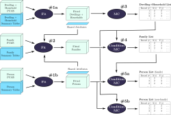
Models of this type have been under development for a long time, and my thesis is part of the ILUTE modelling effort at the University of Toronto. The figure below shows the ILUTE model structure, with land development, household location choice and automobile ownership as integral components of the model, not inputs to the model.
My particular contribution is in the population synthesis part of the model, where I developed a faster and more capable method for synthesizing person, family, household and dwelling agents/objects; and a more robust method for creating the initial relationships between these agents.
- Presentation: aimed at a fairly general audience (new civil engineering students), but perhaps a little cryptic without the narration.
[HTML | Powerpoint] - Thesis: all of the gory details.
[HTML | PDF]
Backcasting: From Climate to Transportation
This is a follow-up to my earlier post about Monbiot’s book on climate change. In that post, I stated that I was interested in long-term emissions targets because they will probably constrain transportation planning over the course of my career. Now that I’m looking at the issue more closely, I’ve found some relevant research: a great report from Robin Hickman and David Banister in the UK, Visioning and Backcasting for UK Transport Policy or VIBAT. (Reference courtesy of Todd Litman, VTPI.) It looks at the transport problem in the UK through a similar lens as Monbiot, but with considerably more rigour. For the record, VIBAT is not yet published in a peer-reviewed journal, although it has been presented at academic conferences. To date, I have only read the executive summary and skimmed the rest.
Domestic transportation in the UK emitted 39 MtC/year (megatonnes of carbon per year) in 1990, the Kyoto baseline. It rose slightly to 41 MtC/year by 2000, and is projected to rise to 52 MtC/year by 2030 in a “business-as-usual” scenario. A recent Department for Transport white paper suggested new policies for the UK, and projected that the 2030 level would be 38 MtC/year if those policies were adopted, a very small reduction from 1990 levels.
Hickman and Banister took a more dramatic approach. They chose a target of 60% reduction in domestic UK transportation emissions by 2030 from the standard 1990 baseline, aiming for a 15 MtC/year emissions level. This is not Monbiot’s target of a 90% cut by 2030, but it’s still an ambitious choice, somewhat more aggressive than the official UK goal of 60% by 2050.
In the early framing of the paper, the problems of air travel are abundantly clear: UK international air emissions are currently 8 MtC, and might be projected to rise to 20 MtC by 2030. I can’t imagine a scenario where it would be politically acceptable for air travel to be given a bigger slice of emissions than all domestic transportation. As the authors state, “Reducing carbon emissions from international air travel should be a priority for research and action.” In the report, they focus on domestic emissions alone, and leave air travel and international shipping outside their scope.
The authors came up with two scenarios for the policy climate in 2030.
Continue reading Backcasting: From Climate to Transportation
Site Split
In the wake of the Facebook explosion, I’ve been thinking more about my public/private face on the web. This site started as a personal site with some professional sidelines, like my old work in computer graphics and my transportation bibliography. However, I’ve decided that I want this to primarily be my professional face to the world, and so I’m splitting the blog in half. This is mostly just for cleanness of presentation, avoiding littering my professional site with personal cruft.
My personal posts will now be at personal.davidpritchard.org; please visit at your leisure, update your bookmarks and add the new side to your feed reader. My professional posts will remain on this site. If you do want to read both, you can just subscribe to both, or use the blended feed.
As part of this reorganization, I’m also going to start publishing a feed of news clippings I find interesting. Both the professional and personal sites have an additional feed on the right that you can subscribe to if you’re interested. The professional one is focused on transportation and land use articles, while the personal one has more entertainment, web miscellanea and politics. Also, in case you missed the addition, my personal site has a list of movie reviews in the sidebar (using the same plugin as Eric).
Finally, if you’ve never tried using feeds and “subscribing” to blogs, I encourage you to try it out (click on the “Entries” link at the top right of the site). Google Reader is a great tool for following blogs, and it makes it far easier to absorb information from far-flung corners of the web. You can read more about it on Wikipedia.
Monbiot & Climate Mitigation

I’ve recently finished reading George Monbiot’s Heat: How to Stop the Planet from Burning. It’s an interesting piece from a widely-syndicated journalist, and it left me both alarmed and unsatisfied. I’ve held back on writing about it until I had a chance to read up a bit more on the underlying science and discuss the topic with more knowledgeable types, but I think I’m ready to comment.
For the anonymous visitors to this page, let me preface this by saying that I have zero expertise in this topic; I have no climate science training, and this represents my first stab at investigating the area. I am interested in this subject largely in terms of its implications for transportation/land use policy: to decide suitable long-term policies, I need a reasonable idea of the likely long-term acceptable level of carbon emissions.
At its heart, I think the book must be understood in terms of its intended audience: the environmental movement. Monbiot’s book is a call-to-reason for the movement, a plea to avoid the “aesthetic fallacy” of pleasing but impractical solutions: think high-speed rail, biofuels, voluntary conservation, or exclusive reliance on solar/wind power. He also urges some revisiting of traditionally demonised technologies, such as nuclear power and carbon sequestration. On these terms, the book is a valuable shaking-up of traditional environmental viewpoints. After establishing a target for emissions cuts, he devotes most of his book to investigations of the feasibility of current technologies for achieving these targets. His discussion of air travel and “love miles” is particularly prescient. The context for his book is exclusively the United Kingdom, and the solutions he proposed cannot necessarily be directly transferred elsewhere.
In this posting, I want to focus more on Monbiot’s target. He based the book on a simple argument, originally published in a 2006 column he wrote for The Guardian, which you can read yourself.
- A global temperature rise higher than 2°C would likely mean runaway positive feedbacks and unstoppable large amounts of warming.
- If we want mean global temperature rises no higher than 2°C (with 70% probability), we need to aim for atmospheric concentrations of CO2 to stabilise at ~380ppm (or CO2-equivalent gases at 450ppm).
- Stabilisation requires emissions (sources) to equal absorptions (sinks). Land-based ecosystems’ ability to absorb carbon drops at higher temperatures. This will reduce the total land+ocean sink from past levels (4 GtC/year) to 2.7 GtC/year. Note: 1 GtC means “Giga-tonne of carbon”.
- Therefore, we need to cut annual global emissions by 60% to 2.7 GtC/year.
- Furthermore, this cut needs to be completed by 2030.
- Finally, if emissions are to be fairly distributed to individual nations on a per capita basis, then the UK needs to cut its emissions by 90%. Monbiot argues in favour of a carbon rationing system with an equal emission entitlement for each individual.
I’ve dug around a little to see how valid these assumptions are. Continue reading Monbiot & Climate Mitigation
IPCC and Land Use
Mike passed me a recent report from the Intergovernmental Panel on Climate Change (IPCC) Working Group III (Mitigation of Climate Change). The IPCC is quite famous for its reports summarising the scientific consensus on climate science, so I was curious to see what the process and results of their follow-up reports looked like. I only read the transport chapter, since it’s the part I understand.
Overall, it’s a decent summary of current understanding of transportation trends, which is difficult to do at an international level with a wide spectrum of urban forms and demographics. The report includes a summary, and working group members vote on each paragraph to establish the level of knowledge and agreement on the report’s conclusions. One paragraph in particular struck me:
Providing public transports systems and their related infrastructure and promoting non-motorised transport can contribute to GHG mitigation. However, local conditions determine how much transport can be shifted to less energy intensive modes. Occupancy rates and primary energy sources of the transport mode further determine the mitigation impact. The energy requirements for urban transport are strongly influenced by the density and spatial structure of the built environment, as well as by location, extent and nature of transport infrastructure. If the share of buses in passenger transport in typical Latin American cities would increase by 5–10%, then CO2 emissions could go down by 4–9% at costs of the order of 60–70 US$/tCO2 (low agreement, limited evidence).
[page 326, emphasis added]
I’m a little shocked that this paragraph garners low agreement and is considered to be backed by limited evidence. (I’ll exclude the final sentence, since I don’t know anything about that particular study.) The paragraph is already weakened by many words indicating uncertainty – “can contribute” … “local conditions” … “could go down” etc. But there isn’t even consensus with the weakened wording. I emphasised the one sentence on density and spatial structure – my personal research interest. Again, I’m astounded that there is still wavering about this subject.
That sentence represents one of the report’s only discussions of urban form. It appears occasionally elsewhere in the chapter, but the framing unfortunately focuses on transportation, and treats land use as fixed – a massive oversight. While there are occasional mentions of the value of “co-ordinating” transportation and land use, these are not quantified and do not make it into the conclusions of the report. There is a separate chapter on housing, but it focuses on building construction and energy consumption, again omitting urban form. As so often in the past, urban structure is forgotten and falls into the cracks between disciplines.
The report sensibly treats the US as a “special case” in the international context, since it’s so low density. (e.g., increasing transit service in many US cities could plausibly increase GHG emissions – if no new riders are attracted but more buses are on the road). But it’s a double-edged sword – it suggests that US cities can continue to follow an auto-dependent path, since the report doesn’t contemplate changing land use.
At the end of the day, though, the main problem is the inconclusiveness of the research – the focus on the exceptional context of the USA has too often limited researchers from observing the clearer trends in other parts of the world. Integrated land use/transport models are still too immature for this type of policy analysis, and international comparison studies remain plagued by data incompatibilities. Finally, the field rarely presents its results in a policy-relevant manner – I have never seen a transportation/land use report that estimated the cost of a policy in terms of US$/tCO2-equivalent. It’s unfortunate – researchers in fields like biofuels are doing a lot of work to estimate greenhouse gas reductions, and their results are immediately relevant to policymakers.