Tag Archives: toronto

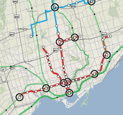
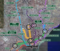
Greater Toronto Area transit map

Many years ago, when Google first released Google Maps and revolutionized online mapping from the stagnant MapQuest era, I put together a few quick demos showing the Vancouver and Toronto transit maps. I’ve made a few updates over the years since then, but not much more.  The Vancouver one is still quite popular – more popular than TransLink’s own map, to be honest – but other web gurus made better Toronto maps, such as the excellent one by Ian Stevens.
I’ve noticed that Google has revamped the mapping APIs and is preparing to eliminate version 2.0. The whole treatment of online mapping is changing rapidly, as the mobile market takes off. I was thinking of just scrapping the Toronto map since it’s not well-used – but then I thought a little further. What if I could make a proper map of the Greater Toronto Area?  Ian’s map doesn’t cover that – in fact, since there isn’t even a good print product covering the full area. Perhaps I could make something useful for the “regional traveller” using GO, and also help mobile users who have trouble with Ian’s site.
I set to work, borrowing liberally from others. It’s a patchwork by nature, since each agency has its own colour and line conventions, but hopefully still useful. When Ian made his map, taking a bitmap image and turning it into tiles was a bleeding-edge endeavour and required painstaking effort – but the tools have improved a lot. Even still, a bitmap this size (35,000 pixels square) takes some horsepower. I didn’t have the energy to do everything Ian did (like removing the background); his map will still probably work better for most TTC riders. I also couldn’t figure out what map projection Oakville Transit used, and couldn’t get it to line up nicely with the other data.
I’ll probably do a few more revisions on this in the next few months – an adjustable opacity slider would be nice, a legend for each operator, and higher zoom levels. But I thought I’d release a beta version and see if anyone likes it, and see how expensive the bandwidth is.
Version 3 of my map is now up (and version 2 is still around for anyone who wants it). New in this version:

  • Local transit operator maps
  • More mobile friendly: full-screen view by default, location-aware (uses GPS to detect your current location, if available)
  • May seem slower, unless you have a new browser, like Google Chrome or Firefox 4
  • Graphics updates: labels cleaner, interchange stations cleaner, labels always visible instead of showing on hover (for touchscreen users)
  • Search tries to find a transit station first, otherwise tries other non-transit locations
  • No legend… yet
  • Added “Get directions to here” link to each station
  • API version 3
  • Fixes: added Lincolnville station, fixed broken links

Bryant and Road Rage


The judicial verdict is in on the sensational case of Michael Bryant. It sounds like a tragic case of a driver whose car’s stop/stall/roll action accidentally provoked an unstable bicycle courier, with tragic and ultimately fatal consequences. The driver appears to have behaved completely reasonably under the circumstances. The cyclist had a long history of aggressive confrontations and appears to have behaved in a threatening manner.
I take no issue with the facts of the case or the judgment. However, the incident has taken on large proportions in the media and the cycling community, and I find the official legal summary wanting in this regard.  The crisp, neutral judicial language gives the document the air of Truth and Justice, when in fact it only represents The Law.
The document answers the legal problem at hand, a judgment on dangerous driving, and therefore focuses entirely on what constitutes “reasonable driver behaviour” under the circumstances.  Lost in the context is what constitutes a reasonable cyclist’s reaction – and while the cyclist was not reasonable, an emotional reaction to having your rear wheel bumped is legitimate, and a subsequent furious reaction to being sent flying over the hood of the car is also fair.  Because the document is necessarily focused on the Law, all such points on the public debate of cyclist/driver perspectives and emotions are out of the picture.  Also lost in the discussion is any mention of the differences between car/car collisions from car/bike collisions – what may be a fender-bender in one context is an unnerving experience in the other, even if the vehicle doesn’t touch the cyclist’s skin, or if the vehicle is only going 13 km/h when it sends the cyclist flying over the hood.
The cycling community’s discontented reaction to the case stems from a desire for the driver world to “please understand our feelings!”  Unfortunately, this particular cyclist’s aggressiveness makes it an unlikely to elicit any soul-searching.  Note however the pattern: whether the cyclist is in the wrong (this case) or in the right (2008 story with a cyclist’s amputated leg), the cyclist will always be the one who gets injured or killed.
The morals: cyclists must hold their tempers, no matter the incident. And, there’s a profound lack of mutual understanding and respect still out there on the streets.

Google Map updates

Several years ago, I put together some Google Maps for the Vancouver and Toronto transit systems. In light of the expected opening of the Canada Line in Vancouver on August 17th, I took a shot at updating the maps.
In the interim, though, Google has made some big advances in its handling of transit. They have a full database of rapid transit stops in Toronto (GO and TTC subway), and a layer that shows the TTC subway lines as well. York Region has provided Google with full local bus data, including schedules, and Google Maps does a fairly nice job of showing that information. That said, the visuals for the transit system aren’t the most attractive, the lines showing the GO rail network are hard to see, and other major transit facilities don’t jump out at the viewer (like the York VIVA BRT Light system or the Spadina streetcar). And in Vancouver, Google still has zero data.
So, my maps still serve a purpose. The changes in this edition are:

Greater Toronto Hamilton Area

  • Added York VIVA Blue and Purple lines
  • Changed Toronto colour scheme to colour code by operator (TTC, GO, VIVA) rather than by line. Changed line thickness to represent “all-day” vs. “peak only” service
  • Added links to TTC and GO station websites
  • The debate over “what to include on the map” is growing in my mind. Should St. Clair and Spadina be in, since they have partial segregation from traffic? Should the north half of VIVA Blue really be in, when it has 15 minute frequencies in the peak hour and operates in mixed traffic?

Metro Vancouver

  • Removed 98 B-Line and moved Canada Line to the “present day” map. Updated Canada Line alignment, added numbers of connecting buses.
  • Changed colours to match latest TransLink map, and changed line thickness to represent “all-day” vs. “peak only” service

Codebase

  • Moved to more modern Google APIs now that they exist (e.g., GMarkerManager)
  • Removed labels from map – the Toronto map in particular was far to cluttered, and the speed penalty for showing the labels was too high. They’re still there, but only if you move the mouse over a station icon.

Andy Barrie on Toronto

Andy Barrie (the CBC morning host, for the non-Torontonians in the crowd) gave a speech recently urging a more walkable Toronto, with better public spaces. A lot of it is familiar stuff for the pro-pedestrian crowd, but still encouraging to hear from a figure like Barrie. What I liked best, though, were his comparisons of Toronto and Montreal:

“After moving to Toronto in 1977, one of first things I noticed just walking around was that people didn’t meet your eye. Everybody I know comments on this. Nancy White, the singer/songwriter, calls Toronto the ‘city of the averted eye.’ People here just don’t look at you. In Montreal, when I first got there, I used to think that every single woman I saw in the street was coming on to me. Eye contact is a given there.
“Something I realized very soon after coming here,” elaborated Barrie, “was that Toronto was a city of strivers. The place is made up of people who wanted more than wherever they came from could offer so they went looking for a bigger arena, a better sandbox. They were very, very work oriented.
“After I had moved here a friend from Montreal asked me what it was like and I said that Toronto was like a woman you marry for her money. Montreal was like a woman everybody told you to get rid of because she’d eat you alive and yet you couldn’t pull yourself away.

Is it still accurate? Somewhat. True enough to be recognisable, and certainly matching some of my impressions when I landed back here one year ago.

GO Transit


I’ve been reading Steve Munro‘s blog lately, as he discusses the nitty-gritty details of transit planning in Toronto. He brought up an interesting point regarding the extension of the Spadina subway line to York University: there’s already a GO transit line that goes direct from York University to downtown, and GO is a better way of feeding people into the downtown than the subway line. (The Yonge line is already at capacity now.)
So what about GO? I’ve only used it once or twice, and I really didn’t know much about it. I didn’t even have a picture of the network. So, I added the routes to my Toronto transit map. It was an interesting exercise – I’d never thought of Dundas West or Leslie subway stations as interchanges, but they are. You get a different view of the connectivity of the city this way – Agincourt is surprisingly close to downtown (a 27 minutes ride), the Danforth station near my parents’ house is only 11 minutes from downtown, and York University is only 22 minutes from downtown. Living in downtown without a car, there are routes to take you a huge distance from Toronto: Bradford, Milton, Hamilton, and Oshawa are all in reach. If you combined GO with a bicycle, you could get to Lake Simcoe or tour the rural areas around Toronto.
The problem, however, lies in the frequency and the hours of operation. Most of those trains only serve one-way peak hour travel, so you can’t use them for a daytrip from downtown to the hinterlands. And they run so infrequently that you would rarely choose them as an alternative to the subway. As Steve Munro suggests, we really need upgraded service on the GO lines. I’d love to see a service like Lausanne offered, with trains in every direction at reasonable frequencies.
I think it’s interesting that GO is so absent from the lives of Toronto residents. As a local, I was completely oblivious to that network – mostly, I guess, because it was nearly useless to me with its present service levels. It doesn’t even show up on TTC maps, which further marginalizes it. My only awareness of GO was where the tracks disrupted my bike ride, like the dip under the tracks on Woodbine. And yet, it could be a valuable part of carfree life in the city.

Toronto Transit Map

Toronto Transit Map
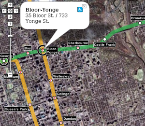
Last August, I put together a transit map for Vancouver using the new Google Maps API. I recently went through and updated all the code, switching it over to XML for the geographic data. Using that backend, I’ve now put together a Toronto transit map. So far, I’ve only got the TTC on there – GO bus and train routes would also be valuable, of course.
It was an interesting exercise to put together. I now understand why I never use the northern part of the Spadina line: north of St. Clair West, it runs directly under the Allen Expressway, which kills the life around those stations. When transit and freeways compete, freeways usually win. I also now see the folly of the Sheppard line: I think it’s too close to the 401 to compete. Additionally, since it’s north of the 401, it’ll never be able to capture much ridership from anyone living south of the 16-lane freeway, even though there’s probably more potential for dense development on the south side, closer to downtown. It’s interesting to compare the station density in Toronto and Vancouver: the Toronto stops are much, much closer together than the Vancouver stops. The new Sheppard line is similar to Vancouver station spacing, though.
And incidentally, I’ve also updated the Vancouver transit map to include the two routes that’ll be finished in 2010: the Canada Line (a.k.a. RAV / Richmond-Airport-Vancouver) that will replace the 98 B-Line and the Evergreen Line that will replace the 97 B-Line.
I’d like to allow others to add a transit layer to maps on their web pages. When I last used Housing Maps to view CraigsList listings on google maps, I found myself desperately wanting a transit overlay. I think it’d be possible to write a Mozilla addon button that just added a transit map to whatever webpage you’re viewing… I’ve just got to figure out how to do it.

Secret Toronto subway stations

As a longtime Toronto subway user, I always liked the weird parts of the subway: the urban legends about running the tracks between stations, the “garbage pickup” trains around 2:00am, and the horrible stories about suicides and subsequent therapy for drivers. But I never heard about the secret stations beneath my feet. Apparently, Bay Station has a second level that was only open for six months, and Queen Station also has a second level underneath it. They’re still there, ghostly rooms in the heart of the city: Toronto’s lost subway stations.