Category Archives: modelling & sci/tech

Adventures in Vintage Emme

Imagine there are no variable names. Imagine working – in 2016 – with registers. Imagine one minute file load times. Imagine that all commands are just numbers. Imagine there’s no usable string processing.

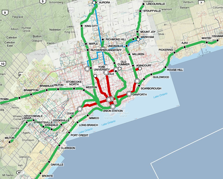
Welcome to Emme 3. During the years that I worked in travel demand forecasting, this was the main tool available to me.

Emme was undoubtedly a trailblazing innovator when it first came out in 1982 and remained a power user’s dream through to the early 90s. But it clearly missed the Windows boat; the software seems to have stagnated until beginning a revival in the late 00s.

Emme 2’s graphical capabilities
Continue reading Adventures in Vintage Emme

From Data Science & Transportation to Software

mds
As of early September, I’ve shifted to a new job in software development / 3D graphics with Mental Canvas. This comes after eight years as a data scientist / transport modeller at Metrolinx. I’m very excited to take on this new position, and I’m particularly keen to shift to a job where the product is working software instead of analysis and advice.
While the transportation modellers I’ve talked understand the close relationship between software and modelling, for others in transportation this seems like a drastic shift in direction. It’s not; the two jobs have quite a bit in common, and I’d like to explain the shared ground. To me, there are three basic stories here:

  • Similar Data: both transportation and graphics have a lot of similarly structured data. Both jobs involve a lot of time organizing, structuring and automating the flow of data.
  • Data Science & Software: a software person would use the term “data science” to describe transport modelling; it’s a hybrid of software and statistics, applied to the problems in the transportation field. Data Science and Software Development are closely related career paths.
  • Software and Transportation are Converging: or perhaps more boldly, software is in the early stages of disrupting the transportation sector.

Continue reading From Data Science & Transportation to Software

Communicating Visually, Using Data

Picture1I’ve long been a fan of data visualization, dating back to my days in the Imager lab at UBC, which had a research area in that subject. I’ve realized that my approach to “telling stories visually with data” includes a lot of knowledge that isn’t common in the transportation world, and I decided share what I know.
Drawing from the Internet, here’s a basic collection of content that gives a good introduction to how to communicate visually, using data. It’s even more compelling if you have my running commentary alongside… batteries not included.

  1. Telling Compelling Stories with Numbers
  2. Graphical Integrity
    • Edward Tufte slides (selected slides; original here)
  3. The Human Visual System
  4. Colour
  5. Tabular data
  6. Maps
  7. Closing Thoughts & References
    • Examples
    • Tufte, “Graphical Displays Should…” & Pantoliano
    • Tufte, “Principles of Graphical Excellence”
    • Kelleher & Wagener – Ten Guidelines

I haven’t covered one area in here: the basic principles of graphic design. But these are more widely known and can be learned in normal courses.

Scrums outside the Software world

Scrumboard picture The agile process (or “scrum”) is very successful in the software world, but little known outside. My team has been doing scrums at a transit agency for 3-4 years, and I get asked about it regularly. I’ve assembled a few links that are useful for explaining it without being too jargony or software-specific.
I’ll talk more about:

  1. Visual Management
  2. Agile Product Development
  3. Scrum Process

Continue reading Scrums outside the Software world

Toronto transit map updated

A very quick update – I’ve finally updated my Toronto transit map to use more recent map information. As of March 2016, the maps now show data from roughly Dec. 2015 for all GTHA transit systems. (I hadn’t had time to update them since originally building the map in 2011.)
The main visible change is that the TTC map is now simpler and shows route frequency with the thickness of the lines. Unfortunately, I may have difficulty updating the TTC map going into the future – as of 2016, their map is now more “conceptual” and is not geographically accurate; I can’t readily warp it to sit on a geographically-accurate map.

Federal Transit Administration (FTA) forecasting workshops

Many years ago, I found an excellent resource for transit modelling: slides from a series of 2006-2009 workshops held by the US Federal Transit Administration (FTA) advising agencies applying for federal funding for rapid transit construction under the “New Starts” funding program. It’s very deeply buried on their website, and since then I’ve seen very few people reference this material, nor have I seen it assembled into a formal report.
So, for those interested – I’ve pulled together an easier-to-use table of contents to the three separate workshops, and tried to “deep link” into them to make it easier to browse and find the material. Enjoy!
UPDATE April 2016 – FTA has reorganized their website and the reports are no longer available there. I’ve mirrored everything here on my website.
Continue reading Federal Transit Administration (FTA) forecasting workshops

Consistency in Time Weights

Modellers all learn about the different components of transit trip travel time, and the “perceived” weights that people put on them. It’s a useful insight into how transit works, and I find it’s a great exercise for testing how “useful” a new transit service is. The trouble is, after learning about weights, everyone wants to customize them – for their economic analysis, for one component of their model, etc.  And analysis quickly gets inconsistent. Here’s why I think that’s often a bad idea – and why I think the weights used in transit assignment should be applied, unchanged, for all other parts of analysis.  (And it’s not just me – the US Federal Transit Administration made this exact point in a 2006 discussion.)

The scenario

Suppose that we have a four-stage model with different transit time weights: Continue reading Consistency in Time Weights

Transit Map Mashup (Tech Talk)

GTHA Transit MapA few years ago, I built a Google Maps app that combined the maps from several Toronto transit agencies all in one mashup map. I never got around to discussing the technical issues associated with that effort, and thought it might be worth writing up. This is an extra-technical post, covering the GIS / raster graphics / GDAL programming techniques I used to make the mashup work, for anyone else interested in trying a similar exercise. Continue reading Transit Map Mashup (Tech Talk)

Represent Data

I recently received an NGO request for the House of Commons members’ contact information in Comma Separated Value (CSV) format. I quickly found the helpful Represent website by Open North. This small group who has scraped government websites and created machine-readable versions of MP contact information, plus a minimal maps interface layered on top.
However, the Represent effort leans a little too “techno-elite.” The results are provided in the JSON format, a hyper-current, versatile and Web-buzzword-compliant format. But most NGOs I know are still struggling to figure out Excel, never mind anything more recent; and Excel can’t handle much more than CSV files (if even that – modern web-friendly text encodings like UTF8 don’t even work properly).
So, I put together a quick bit of Javascript to convert the Represent JSON format to CSV format, ready for Excel to use. This should be “live” – pulling the latest version from Represent each time. Here are links to a few of the Represent datasets:

Federal

Provincial

Advances in Population Synthesis, the journal article

I’ve finally published my M.A.Sc. thesis as a journal article, under the title Advances in Population Synthesis: fitting many attributes per agent and fitting to household and person margins simultaneously.
This article is the preferred citation going forward; I think it tells the story best:

  • A brief summary of the key contributions described in detail in my thesis
  • A better explanation of the U.S. context and the applicability of this work outside Canada. Statistics Canada goes to great lengths to protect Canadian privacy, and some of my work was motivated by the particular difficulties associated with Canadian census data.

My thesis is still a good source for anyone wanting greater detail, or anyone interested in a clear explanation of some of the Canadian data sources I used.
Continue reading Advances in Population Synthesis, the journal article