I recently found a neat XAML user interface trick that I hadn’t seen in my usual resources. Suppose you have:
- a grid-based responsive user interface that you want to grow/shrink to fit the window
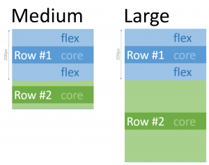
- suppose it has a fixed width, and each row has a “core” minimum height it needs.
- then there’s some extra vertical space that you want to sprinkle around
- you have some priorities – first give row #1 extra space, then row #2 any extra.
XAML makes it easy to do proportional space allocation – e.g., give row #1 two-thirds and row #2 one-third by giving them “2*” and “*” height respectively. But it doesn’t do priorities.
The trick: combine a massive star size with a MaxHeight. That looks like this:
<Grid>
  <Grid.RowDefinitions>
    <RowDefinition Height="1000*" MaxHeight="200" />
    <RowDefinition Height="*" />
  </Grid.RowDefinitions>
</Grid>
Essentially, row #1 gets “first claim” on any extra space, up to a limit of 200 pixels. Any extra space beyond 200 pixels falls over to row #2.