As of early September, I’ve shifted to a new job in software development / 3D graphics with Mental Canvas. This comes after eight years as a data scientist / transport modeller at Metrolinx. I’m very excited to take on this new position, and I’m particularly keen to shift to a job where the product is working software instead of analysis and advice.
While the transportation modellers I’ve talked understand the close relationship between software and modelling, for others in transportation this seems like a drastic shift in direction. It’s not; the two jobs have quite a bit in common, and I’d like to explain the shared ground. To me, there are three basic stories here:
Similar Data: both transportation and graphics have a lot of similarly structured data. Both jobs involve a lot of time organizing, structuring and automating the flow of data.
Data Science & Software: a software person would use the term “data science” to describe transport modelling; it’s a hybrid of software and statistics, applied to the problems in the transportation field. Data Science and Software Development are closely related career paths.
Software and Transportation are Converging: or perhaps more boldly, software is in the early stages of disrupting the transportation sector.
A very quick update – I’ve finally updated my Toronto transit map to use more recent map information. As of March 2016, the maps now show data from roughly Dec. 2015 for all GTHA transit systems. (I hadn’t had time to update them since originally building the map in 2011.)
The main visible change is that the TTC map is now simpler and shows route frequency with the thickness of the lines. Unfortunately, I may have difficulty updating the TTC map going into the future – as of 2016, their map is now more “conceptual” and is not geographically accurate; I can’t readily warp it to sit on a geographically-accurate map.
Many years ago, I found an excellent resource for transit modelling: slides from a series of 2006-2009 workshops held by the US Federal Transit Administration (FTA) advising agencies applying for federal funding for rapid transit construction under the “New Starts” funding program. It’s very deeply buried on their website, and since then I’ve seen very few people reference this material, nor have I seen it assembled into a formal report.
So, for those interested – I’ve pulled together an easier-to-use table of contents to the three separate workshops, and tried to “deep link” into them to make it easier to browse and find the material. Enjoy! UPDATE April 2016 – FTA has reorganized their website and the reports are no longer available there. I’ve mirrored everything here on my website. Continue reading Federal Transit Administration (FTA) forecasting workshops→
Modellers all learn about the different components of transit trip travel time, and the “perceived” weights that people put on them. It’s a useful insight into how transit works, and I find it’s a great exercise for testing how “useful” a new transit service is. The trouble is, after learning about weights, everyone wants to customize them – for their economic analysis, for one component of their model, etc. And analysis quickly gets inconsistent. Here’s why I think that’s often a bad idea – and why I think the weights used in transit assignment should be applied, unchanged, for all other parts of analysis. (And it’s not just me – the US Federal Transit Administration made this exact point in a 2006 discussion.)
My employer recently hired Jarrett Walker to run his Transit Network Design course. I’m a long-standing fan of Jarrett’s work and regularly recommend his Human Transit book to colleagues.
I quite enjoyed the course, and it triggered thinking in three main areas for me:
Pulses / Timed Transfer Hubs for low-density areas
Completing the Grid using capital investment
Designing for Coverage vs. Ridership on a single corridor: local-vs-rapid stop pattern
The course revolves around group “build a network” games, and those games will clearly play out differently depending on the attendance. Our course included several staff who work on bus scheduling, several who work on rapid transit planning, and many in areas further afield. That meant that each group had several experienced and numerically savvy staff, who could quickly get up and running with headways, frequencies and cost unit rates, without any tutorial.
What would happen if we deployed a sensible “bundle” of policies all at once?
How do individual policies compare, within that bundle?
In this post, I’ll continue by looking at:
What about at a “maximum” level?
Conclusions
What does maximum deployment look like?
In the previous post, I looked at a few of the “big impact” policies. At the time, I focused on the “aggressive” deployment level. In this section, I want to switch gears to the “maximum” deployment level and dive a little deeper.
Three years ago, an excellent report advanced my understanding of which transportation/land use policies can really help to tackle climate change. From all appearances, that report has disappeared beneath the waves without a trace; I’ve met few policy advisors who have read it.
The report is Moving Cooler, written by consultants at Cambridge Systematics in 2009. It’s a non-academic technical piece with good math but poor messaging and graphics, and while there was some promotion during the study process, I’ve seen no follow-through. Together, this probably explains why it went unnoticed.
I’ll walk through the report findings in four stages:
Scope and approach
What would happen if we deployed a sensible “bundle” of policies all at once?
How do individual policies compare, within that bundle?
What about at a “maximum” level? (Discussed in part two.)
My own perspective in this post will be to understand two questions:
How quickly can we realistically hope to reduce emissions within the transportation sector?
Which policies offer the greatest potential at a reasonable cost? (This will necessarily ignore other considerations, such as equity or acceptability. To me, the first question is “does it work?” and only then is it worth asking “is it fair?” and “is it politically realistic?”
The report itself was never freely available, but executive summary material and appendices were online until quite recently. As the report website has recently disappeared, I’ve reposted a few of the freely available items for reference:
There are three key items to be aware of when interpreting the study:
The study scope focuses only on policies in two of four areas:
included: travel activity changes by reducing the distance travelled or shifting to more carbon-efficient modes of travel.
included: vehicle and system operations by improving traffic flow.
not included: vehicle technology, such as electric vehicles
not included: fuel technology, such as cellulosic ethanol
Confusingly, the “bundles” in the study and the graphs showing potential emission reductions all exclude carbon pricing or fuel taxes or other economy-wide pricing initiatives. These policies are covered elsewhere in the text, but the presentation is quite confusing, especially considering that these are likely the most important policies. I will attempt to cover them more clearly here.
The study sponsors and steering committee are largely so-called “interest groups” such as environmental NGOs, Shell Oil and ITS America. Surprisingly, this membership hasn’t significantly coloured the study findings or objectivity. The study does not make recommendations and the dry, clinical tone is undoubtedly a requirement for a neutral policy study of this sort with a diverse set of stakeholders.
The study is quite U.S.-centric, but I feel the findings could be easily extrapolated to most English-speaking countries, who have all experienced 65 years of substantial post-war growth in low-density auto-oriented suburbs.
What can a full bundle do?
I’m not going to reiterate what the report itself says well. The executive summary is quite clear; I’ll just add my own interpretation. There are a few helpful points to add regarding the baseline scenario:
The future fuel prices make sense. I was initially concerned that this 2008-09 study might be too optimistic, as it relies on Energy Information Administration (EIA) forecasts, which were notoriously optimistic prior to their 2009 release. However, the study clearly tried to grapple with the issue in the absence of EIA guidance and they came up with a fairly reasonable scenario, midway between the EIA’s 2012 “baseline” and “high oil price” scenarios extrapolated out to 2050. That fuel price assumption is essentially $3.70/gal in 2010 with a 1.2% real annual increase thereafter, giving about $6/gal by 2050 (in real dollars).
The fuel efficiency assumptions are an “optimistic business as usual” scenario, with fuel efficiency improving from 20 mpg to 44 mpg by 2050. This doesn’t include significant policy to reduce gasoline usage through vehicle technology or alternate fuels
I would characterize the aggressive and maximum scenarios as shown in the above figure (adapted from Figure ES.3). In this figure, I’ve added in the effect of the carbon price / fuel tax policies. As can be seen, this shows considerable potential for carbon reductions from the full policy bundles studied. The key messages:
Travel activity policies can have a real effect, up to a quarter of transportation emissions.
Strong carbon pricing of some form must be a part of the mix to make a real dent in emissions; the majority of the reductions shown are due to the pricing policy alone, and the pricing policies have the highest potential early on.
Additional policies in the vehicle and fuel technology areas are required to hit the long-term reduction targets.
The report’s executive summary and figures don’t hammer these points home enough, in my view.
Of course, the climate will continue to change unless we can reach zero annual emissions. Until then, each year’s emissions will accumulate in the atmosphere, adding to the warming. The figure above shows the same information in terms of “total accumulated emissions to the atmosphere between 1990 and 2050.” As long as the emissions curve keeps going up, the climate will keep getting warmer.
What can individual policies do?
The report’s executive summary does a poor job of comparing individual policies or policy categories. I will draw my own highlights instead. Let’s take a look at each policy category and the “best of breed” policy from an emissions perspective, at an “aggressive” deployment level.
Strategy
Biggest Policy in Strategy
Emissions Reduction
(MT)
Cost
Pricing
Carbon pricing
4,410
< $0.05 B
Regulatory measures
Speed limit reductions
2,320
$6.5 B
Systems operation and management strategies
Eco-driving
1,170
< $0.05 B
Land use and smart growth strategies
Combined land use
865
$1.5 B
HOV / carpool / vanpool / commute strategies
Employer based commute strategies
486
$120.8B
Public transportation strategies
Urban transit expansion
281
$503.0B
Non-motorized transportation strategies
Combined pedestrian
171
$30.4B
Multimodal freight strategies
Truck APUs
148
$0.3B
Bottleneck relief and capacity expansion
Bottleneck relief
(5)
$71.4B
This really says it all:
Pricing measures are number one, with a bullet. For anyone who’s been around the transportation field for a while, this is fully expected.
The number two and three measures are probably surprises to many people: speed limit reductions and eco-driving. There’s a reason why Nixon implemented speed limit reductions in the 1970s: they really work at reducing gasoline usage. Eco-driving is also the only effective policy in the “system operations” group (which otherwise consists of ITS road technologies like ramp metering and incident management).
Numbers four through seven are the usual suspects in “green” circles. But the order may come as a surprise – public transit is a long way down the list.
Freight emissions are tough: the maximum impact policy is quite small.
“Bottleneck relief” and “capacity expansion” make the problem worse, not better.
The top strategies are all quite cheap. The most popular strategies (transit, bottleneck relief) are extremely expensive.
All of this hinges on the underlying analysis, but I feel it’s pretty solid. The appendices of the report give all of the gory details; they’re stellar examples of how to do high-level “sketch” planning. At some point, I’d be curious to try it out with Canadian data; I doubt the results would be very different, though.
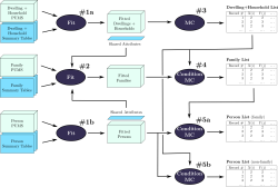
I’ve finally published my M.A.Sc. thesis as a journal article, under the title Advances in Population Synthesis: fitting many attributes per agent and fitting to household and person margins simultaneously.
This article is the preferred citation going forward; I think it tells the story best:
A brief summary of the key contributions described in detail in my thesis
A better explanation of the U.S. context and the applicability of this work outside Canada. Statistics Canada goes to great lengths to protect Canadian privacy, and some of my work was motivated by the particular difficulties associated with Canadian census data.
My thesis is still a good source for anyone wanting greater detail, or anyone interested in a clear explanation of some of the Canadian data sources I used.
Many years ago, when Google first released Google Maps and revolutionized online mapping from the stagnant MapQuest era, I put together a few quick demos showing the Vancouver and Toronto transit maps. I’ve made a few updates over the years since then, but not much more. The Vancouver one is still quite popular – more popular than TransLink’s own map, to be honest – but other web gurus made better Toronto maps, such as the excellent one by Ian Stevens.
I’ve noticed that Google has revamped the mapping APIs and is preparing to eliminate version 2.0. The whole treatment of online mapping is changing rapidly, as the mobile market takes off. I was thinking of just scrapping the Toronto map since it’s not well-used – but then I thought a little further. What if I could make a proper map of the Greater Toronto Area? Ian’s map doesn’t cover that – in fact, since there isn’t even a good print product covering the full area. Perhaps I could make something useful for the “regional traveller” using GO, and also help mobile users who have trouble with Ian’s site.
I set to work, borrowing liberally from others. It’s a patchwork by nature, since each agency has its own colour and line conventions, but hopefully still useful. When Ian made his map, taking a bitmap image and turning it into tiles was a bleeding-edge endeavour and required painstaking effort – but the tools have improved a lot. Even still, a bitmap this size (35,000 pixels square) takes some horsepower. I didn’t have the energy to do everything Ian did (like removing the background); his map will still probably work better for most TTC riders. I also couldn’t figure out what map projection Oakville Transit used, and couldn’t get it to line up nicely with the other data.
I’ll probably do a few more revisions on this in the next few months – an adjustable opacity slider would be nice, a legend for each operator, and higher zoom levels. But I thought I’d release a beta version and see if anyone likes it, and see how expensive the bandwidth is. Version 3 of my map is now up (and version 2 is still around for anyone who wants it). New in this version:
Local transit operator maps
More mobile friendly: full-screen view by default, location-aware (uses GPS to detect your current location, if available)
May seem slower, unless you have a new browser, like Google Chrome or Firefox 4
Graphics updates: labels cleaner, interchange stations cleaner, labels always visible instead of showing on hover (for touchscreen users)
Search tries to find a transit station first, otherwise tries other non-transit locations
No legend… yet
Added “Get directions to here” link to each station
An appalling decision from the Canadian federal government today, reported by the Globe & Mail here: “Tories scrap mandatory long-form census”
The census is a vital data source for all sorts of transportation and land use planning. A voluntary census is nearly useless, since the sample will suffer from voluntary response bias. This will do nothing to reduce the number of analysts and bureaucrats – provincial governments will be forced to step in and collect the same data themselves, but this will inevitably result in the loss of province-to-province comparisons.
As for privacy, the alleged basis for this decision: Statistics Canada jumps through all sorts of hoops to ensure the privacy of respondents. It would be difficult if not impossible to connect any of the published census data back to an individual. Yes, the questions are detailed and probing; but the anonymization process used by Stats Can is tougher than anywhere else in the world that I’ve seen.


 An appalling decision from the Canadian federal government today, reported by the Globe & Mail here: