A few years ago, I built a Google Maps app that combined the maps from several Toronto transit agencies all in one mashup map. I never got around to discussing the technical issues associated with that effort, and thought it might be worth writing up. This is an extra-technical post, covering the GIS / raster graphics / GDAL programming techniques I used to make the mashup work, for anyone else interested in trying a similar exercise.
In my fantasy world, I could use vector data for this purpose: get the transit route shapefiles from the agencies, come up with an attractive way of rendering them to a giant imagefile, and then split that up into tiles for Google Maps display. But that’s a pipe dream: GTFS data isn’t available for several agencies, and the effort required to display the GTFS shapes in an attractive manner would be quite substantial.
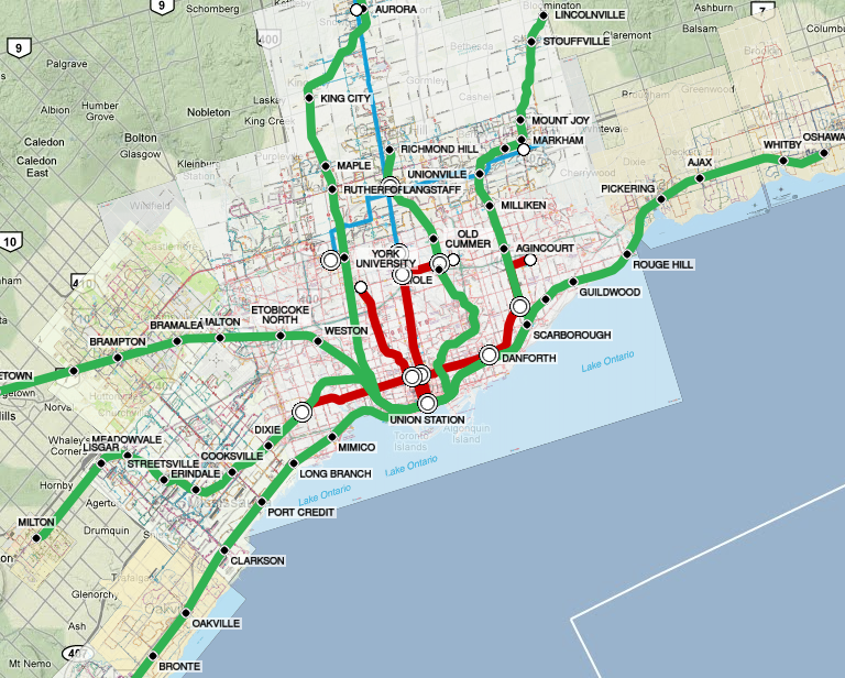
So, I picked the pragmatic quick-and-dirty route: take the published PDF maps and merge them together in some way. How can that be done effectively?
The Process
| Action | Tool used |
|---|---|
| 1. Rasterize one of the PDF maps to a PNG. | Anything would work. I used GIMP with 150-400dpi depending on the agency, aiming for roughly the same geographic area per pixel. |
| 2. Mask/cut out the parts of the map that are covered by other maps. | Anything would work. I used GIMP, and of course had to iterate this process a few times to get a good masking that looked okay. |
| 3. Georeference the raster PNG image (often in a non-standard reference system) to create a GeoTIFF in a standard reference system. | I identified a set of 4-12 reference points per image and then used Quantum GIS to generate a GDALWarp script that would warp the original PNG images to the local reference system (UTM 17N for the Greater Toronto Area). Most of the images were already quite close to this, except usually in a rotated frame where the local “north” is up. I forced GDALWarp to use a 2x resolution, since it has terrible antialiasing even for a simple rotation operation. |
| 4. Rewarp to Google Maps’ preferred global reference system (WGS84). | I used GDALWarp again for this. The WGS84 system is quite distorted compared to the local reference system, and GDALWarp again does a bad job with the aliasing. |
| 5. Downsample by 50%. | Anything would work, and I used GIMP. I added GDALBuildVRT to extract the original georeference data and a script to manually update the georeference information after resampling. |
| 6. Repeat steps 1-5 for each agency’s map. | |
| 7. Merge the images from each agency together onto a single image. | I used GDALWarp‘s mosaicing function for this step, with the downsampled georeferenced TIFFs+VRT from stage #5. |
| 8. Split the (gigantic) merged image into tiles for use with Google Maps. | I used the excellent MapTiler suite for this, which is a simple GUI built on top of GDAL2Tiles |
| 9. Further compress the tile images. | PNGNQ was helpful for squeezing the tile file sizes down a little further. I don’t really want to blow the bandwidth of my webhosting provider. |
| 10. Feed the tiles into Google Maps. | I added this to my existing Javascript-based web map. In the process, I also hacked the maps a bit to work with “high DPI” retina-quality maps, returning overly high-resolution tiles when possible. |
Issue #1: Antialiasing
At time time of work (2011), GDALWarp was appalling at resampling and antialiasing. When I first built this, I didn’t have the “use 2x resolution / use 50% resolution” steps in the sequence. With that original version, lots of the fine detail that was visible in my initial PNGs was mangled beyond belief by the end of the chain of steps – especially for the Hamilton and Milton maps, which have really fine detail.
If GDALWarp had high-quality antialiasing and did its sampling properly, that wouldn’t happen – nothing I’m doing is very elaborate, and the final result is lower resolution than my initial images.
I found myself reading GDAL developer e-mail lists and quickly realized that the development team doesn’t really “get” resampling. My sense was that someone skimmed a book, saw that there are standard types of kernels (bicubic, lanczos, etc.), coded one up and said “case closed” – without really understanding how sampling works. Perhaps this is the reality in the GIS world: most people work with vector data, and raster issues like sampling are really not well understood. It’s possible that it’s also the cost of using a free toolchain – ArcMap might be able to handle this better. GDAL has been remarkably solid in every other respect, just not on this raster issue.
In the end, I added the “upsample by 2x at the start / downsample by 50% at the end” steps, doing a sort of fake supersampling to deal with the poor tools in the middle of the chain. Not ideal, but better than nothing.


Issue #2: Memory
However, that 2x supersampling led to substantial memory issues. The biggest crunch was the final stage in the chain: the GDALWarp mosaic operation generates a very big 33,000 x 31,600 pixel image, and this pushed my (paltry 4GiB RAM) computer to the limit. The uncompressed size of that image is 3.88 GiB, very close to the limit of what my computer could handle. If I hadn’t had to upsample, it would have been just 1.0 GiB, leaving lots of room to manoeuvre.GDALWarp had trouble with that file size, and then most of my image viewing/editing tools had trouble with the merged result.
Closing Thoughts
At the end of the day, the final result is usable but not ideal. It’s a very “mashed” looking mashup and also more of a tech demo than a useful travel tool, lacking the visual style or usability polish that I’d like.
The areas I’d love to improve are:
- Vector data: use vector data where available to generate the raster images and tiles. This would display all routes in a consistent format with a single legend for the entire map. It’d also get rid of the ugly map backdrop everywhere (and especially in Hamilton) and overlay cleanly on top of Google’s own maps.
- More mobile friendly: massive raster maps are not the best way to get data to mobile users over a cellular connection, and Google Maps in a web browser is not very quick. These technologies are such fast-moving targets that I can’t keep up, though.
- Proper GO Transit bus data: the cross-regional services are impossible to read, as each region uses a different format for showing the route (or omits them entirely, like York Region).
- Proper usability: see which parts are actually useful to people!
Lots of ideas for improvement – maybe someday I’ll have the time.
Thanks for the tech details of this David.
You might like to keep an eye on experimental functionality in OpenTripPlanner to display a ‘System Map’ of a series of PT networks as a WMS – https://github.com/opentripplanner/OpenTripPlanner/wiki/GettingStartedSystemMap .
This does require a GTFS feed available from each agency of interest.
Source code was made available in 2021 – https://github.com/drpritch/transit-maps